This post is (also) available in: NederlandsFrançais
Note: only available after purchasing the analysis module. Interested in this feature? Contact us at [email protected].
Introduction
While a newsletter focuses on creating a daily or weekly press overview, a report is typically used for monthly, quarterly, or annual reporting.
Apart from a few specific features, the way it works is identical to newsletters. If you are familiar with creating one, you will easily be able to use these features too!
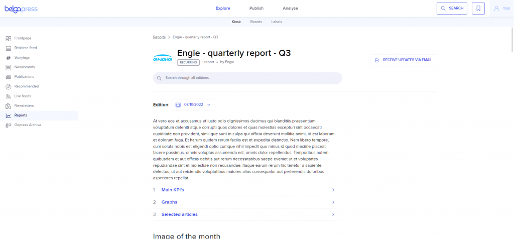
For the bulk of this explanation, we therefore refer you to the section on newsletters. Here, too, is a tip: make your report visually appealing by using the various modules (incorporate images and formatted HTML sections, reinforce your analysis with one or more articles, etc.).
Working with reports
Select the ‘reports’ option under ‘publish’.
In the left-hand column, you will find all the reports ready for you, or you can choose ‘add new report’ to create a new one.
Management is identical to that of newsletters.
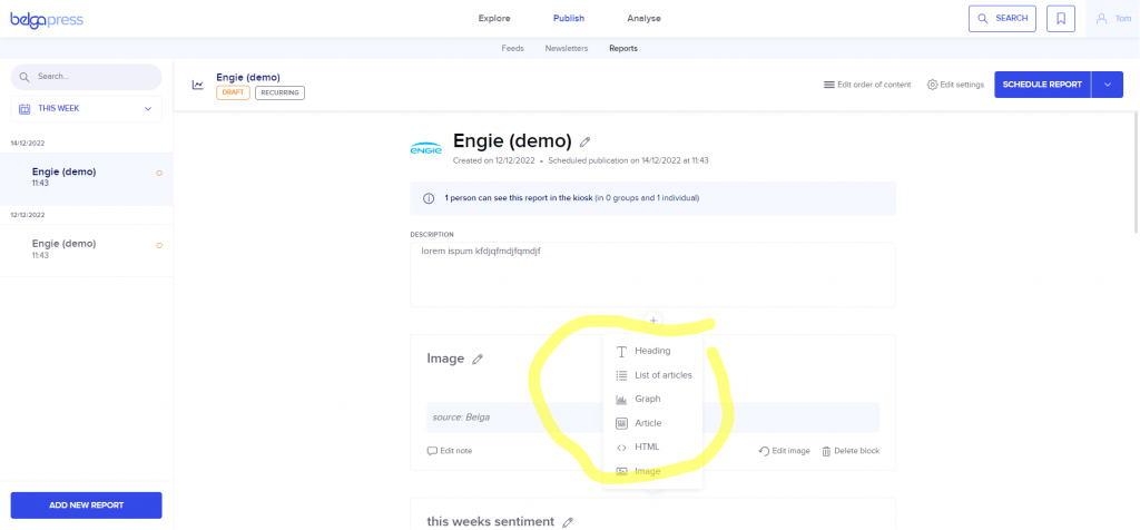
Just like a newsletter, you can assemble this using various types of components, save it as a template, set it to recur, collaborate with colleagues, and share it with a select group of readers after publication. They will receive an email notifying them that the newsletter is available and can access it permanently in the kiosk under ‘reports’.
Working with graphs
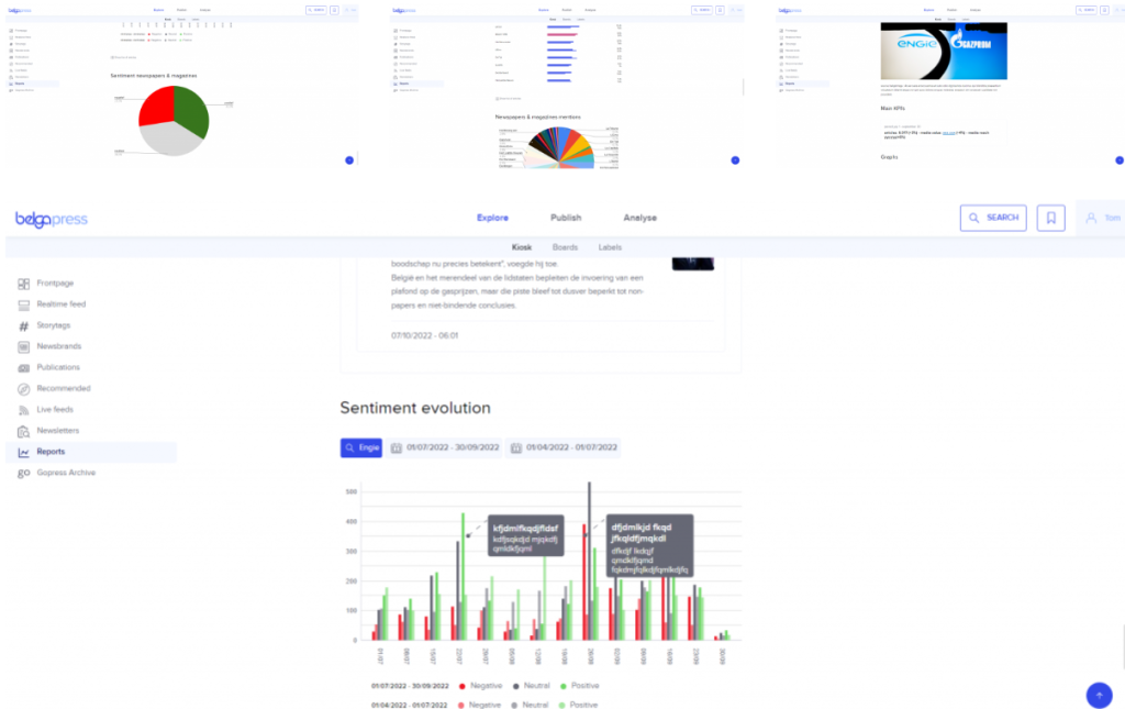
We added the ability to include graphs specifically for reports. Of course, this doesn’t prevent you from adding them to a newsletter as well.
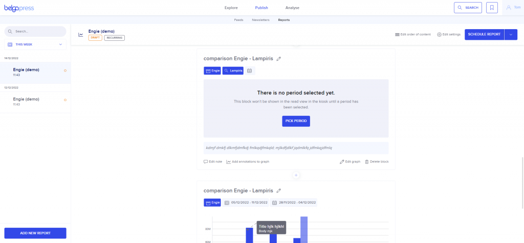
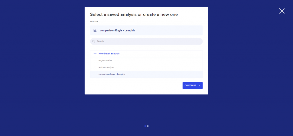
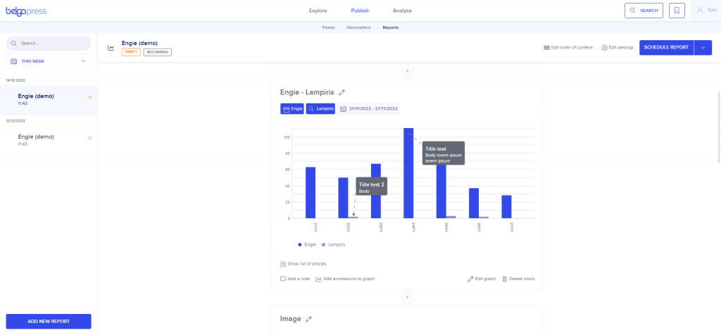
You can add graphs in two ways. From the analysis component, you can select the ‘dynamic graph in report’ option when exporting any chart; these charts are then added to your report as blocks. Alternatively, you can select the ‘graph’ option by clicking the ‘+’ button. In the screen that follows, choose a saved analysis or create a new blank version, then follow the wizard steps until you finally add the graph as a component to your report.
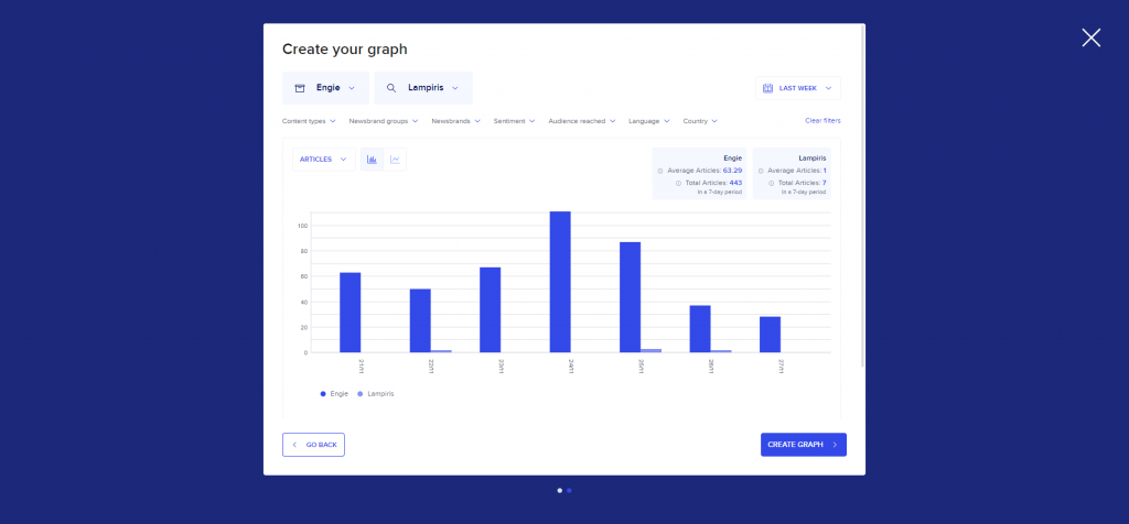
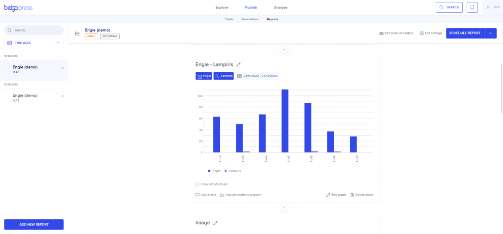
Once you have added a chart, you can work with it further. We include a brief legend with each chart so you don’t lose the context. Just like the other components, you can delete it, add or edit a note, assign a title, and so on. Additionally, you can modify the chart itself: simply click ‘edit graph’, adjust the various selection criteria, and click ‘update graph’.
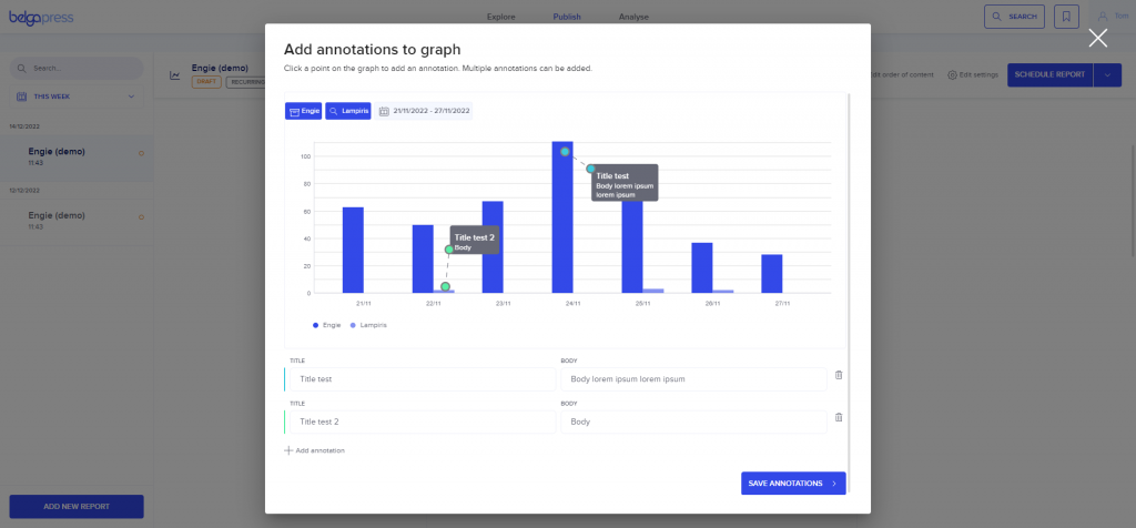
You can also add one or more annotations via ‘add annotations to graph’. Click ‘+ add annotation’ to add an annotation to your graph. Use the handles to move both points to the correct location on the graph and complete the tooltip by entering the title and body text. Add as many annotations as you wish. Use ‘save annotations’ to save the annotations to your graph. To modify or add annotations, click ‘add annotations to graph’ again. You can then add new annotations, or modify or delete existing ones.
When your recurring report is ready, you will notice that the sections containing a graph are empty. You must first select a period. To do this, click ‘pick period’ and complete the next step.