This post is (also) available in: NederlandsFrançais
NOTE: only available after purchase. Interested in this feature? Please contact us via [email protected].
Introduction
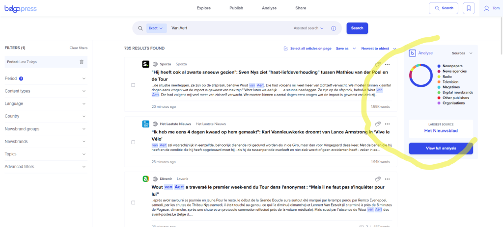
As the name suggests… Belga.press offers you a wide range of media analysis options.
This starts with displaying analysis parameters at the article level, followed by the aggregated charts you see with every search query or press release.
What to expect? In addition to several quantitative parameters (number of hits, media reach, media value (optional), source, etc.), we also focus on qualitative parameters. Currently, this includes sentiment, but in the future, we plan to expand this with bias-oriented parameters, such as emotionality, bias, and articles with a left-leaning, neutral, or right-leaning slant.
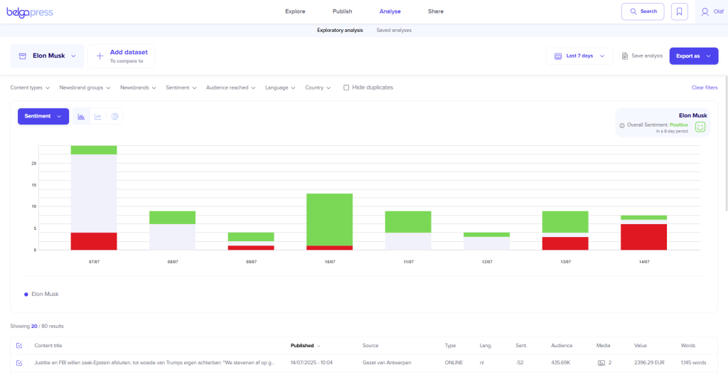
Within the dedicated analysis section, you can graphically view the results for each of these parameters over any given period. This is combined with a view of the specific articles underlying each chart. Adjust the filters yourself and instantly see every updated chart. You can export the results in CSV format, as a PNG for use in presentations, or even as a dynamic chart within a report.
What can I analyze? It’s simple… you can apply the features mentioned above to any board, label, live feed, or even any search query you wish to convert into an analysis. You decide exactly what you want to analyze!
Creating an analysis
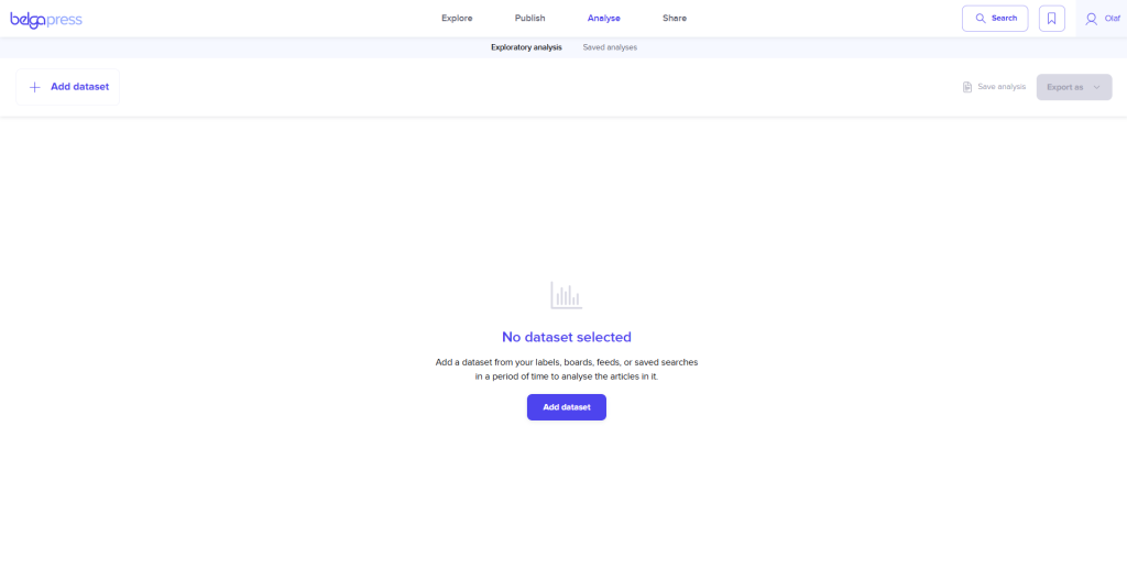
Every analysis begins with the selection of a dataset. As mentioned above, you have full control over what you wish to analyze. If you opt for a board, label, or live feed, please be aware that you will only include articles from the moment that set was created. If you would prefer a perspective over a broader period, choose a “saved search” instead.
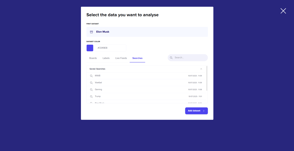
After choosing a dataset, the analysis screen fills automatically. You can also customize each dataset by choosing a color that suits it best.
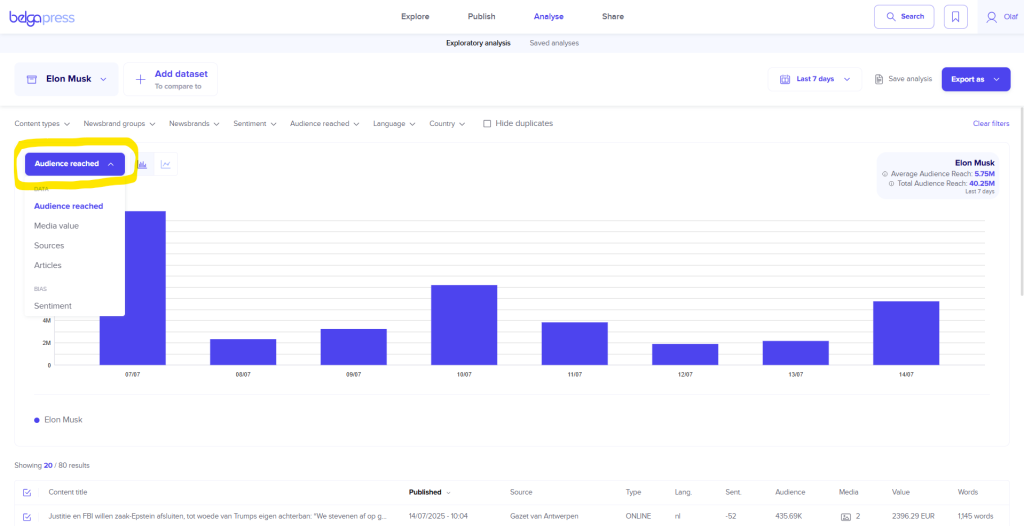
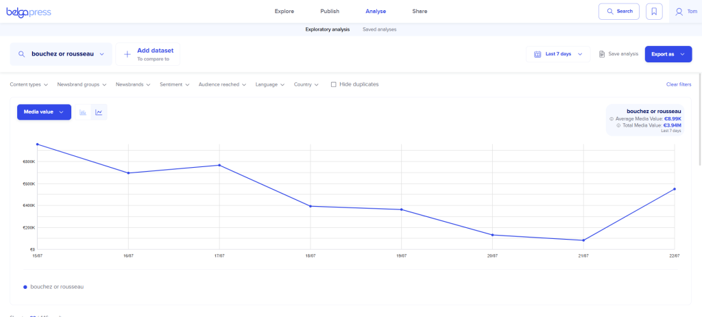
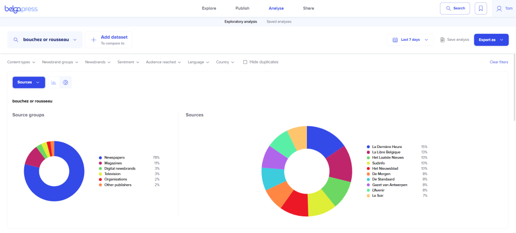
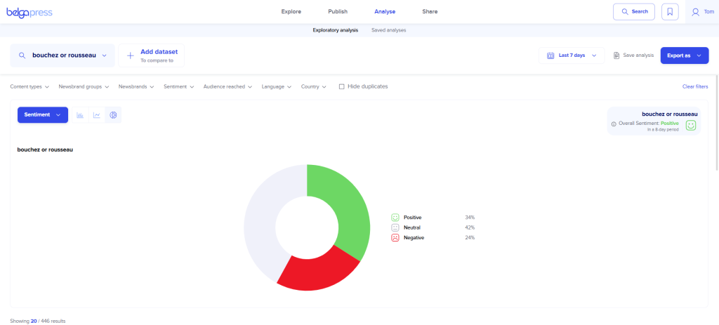
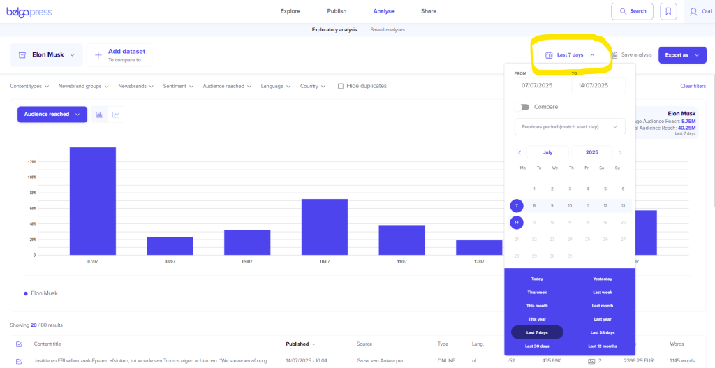
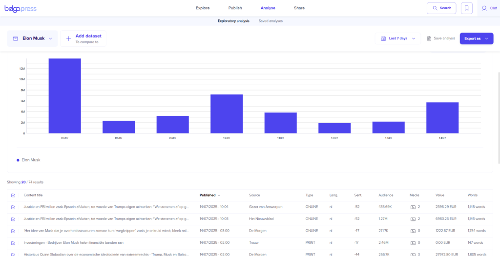
Choose one of the available KPI analysis types, the visualization type, and the time period (the default is “last 7 days,” but you can select any period you prefer). The available visualizations vary depending on the chart type. You can often switch between a bar, line, or donut chart, and we will be expanding these options in the future. You will notice that the chart updates instantly based on your selection. If you hover over any data point, you will see the corresponding values. Below the chart, you will find all the articles that match the data points in your graph. This is helpful as it provides immediate context for each visualization. If you want a closer look at the data set, use the convenient sorting options to place extreme values at the top or bottom. This gives you better insight into, for example, articles with the highest or lowest sentiment scores.
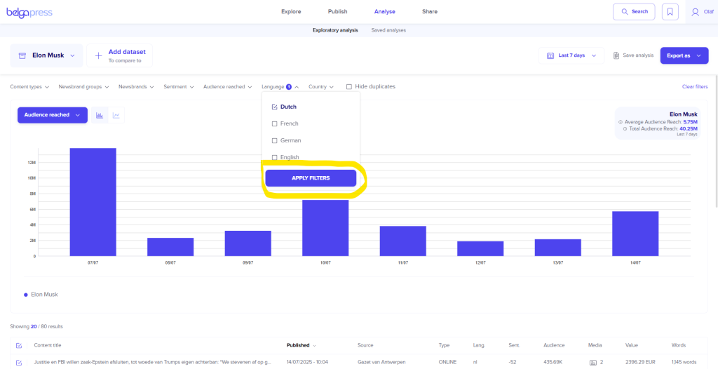
Now you can start fine-tuning each view. You can do this, on the one hand, by applying one or more filters located above the chart (e.g., content type = print). Always click “apply filters” to confirm your selection(s). Use “clear filters” to remove all filters in a single action. On the other hand, you can interact directly with the chart itself. Click on a specific point or bar, and the article list will update to show only the results for that specific data point. Simply click the point or bar again to return to the general overview.
If you want to exclude certain results from the view (for example, if the analytical value is incorrect for your needs), simply deselect them in the list of articles.
Did you pick the wrong dataset after all? Choose “edit” or “delete dataset” and select a new one.
Comparing datasets
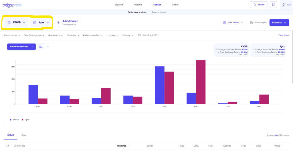
A brand-new feature in Belga.press is the ability to easily compare datasets.
There are 2 methods to choose from!
The first method allows you to add an additional dataset. This can be any type you prefer. For instance, if you want to compare your organization with a competitor, simply place your organization’s dataset alongside theirs. You will notice that the chart immediately compares both datasets. You can compare up to 7 datasets at once! This comparison remains active for every action you apply to the chart.
In the second method, you stay within a single dataset but select the ‘compare’ option via the period selector. The system will then automatically add the equivalent period immediately preceding your selection. This is particularly useful if, for example, you want to compare quarterly results.
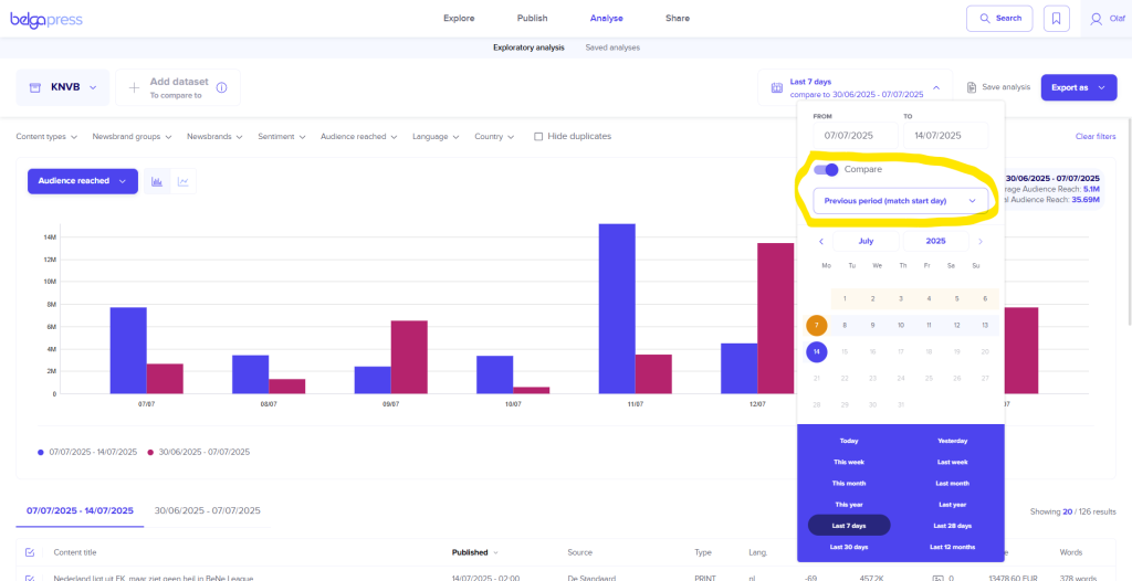
The accompanying legend also reflects the effect of the chosen method, ensuring the charts remain easy to read.
You can easily switch between both methods, though they cannot be combined, as this would make the charts too complex. You can return to the default visualization at any time by removing a dataset or disabling the compare option.
Saving an analysis
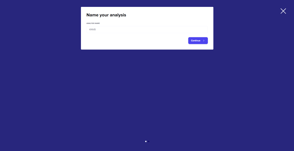
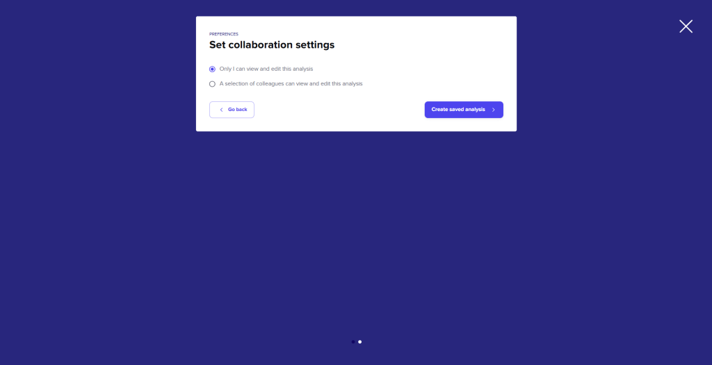
Achieving the exact visualization that meets your specific needs can sometimes require a bit of fine-tuning. To reuse a specific configuration in the future, you can save it for later use. To do this, click ‘Save analysis’, enter a name for your analysis, and click ‘Continue’. If you wish to share the analysis with your colleagues, select the second option on the following screen before saving.
To revisit an analysis at a later time, navigate to the ‘Saved analysis’ section and select the specific analysis you wish to view from your saved list.
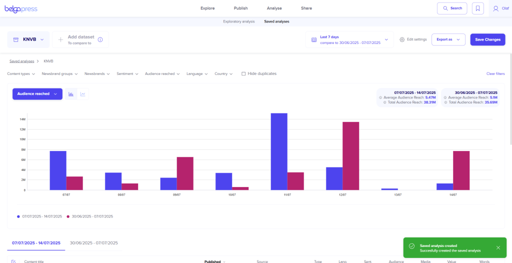
Once you open a saved analysis, you can continue to refine it as needed. You can choose whether to save your adjustments by clicking ‘Save changes’. Through the ‘Edit settings’ menu, you can rename the analysis or update the list of colleagues with whom it is shared. This section also allows you to permanently delete a saved analysis.
To start from scratch, select the ‘Exploratory analysis’ option.
Exporting an analysis
Satisfied with your analysis? Now you can export it for further use.
You have several options available for this.
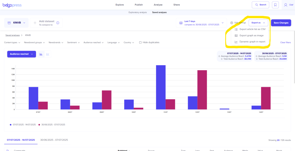
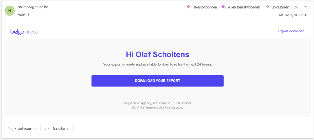
First option: If you like to work with the articles and their analytical KPIs yourself, you can export them as a CSV list. Select this option and click on the list you wish to export on the screen. Belga.press will generate the list in the background and once it is ready, you will receive an email with a download link. Please note: you can export a maximum of 10,000 articles per list. If there are more, please work in batches.
Once you have the list, you can import it into your preferred BI tool (such as Excel or Google Sheets) for further analysis. Any relevant charts generated within your BI environment can subsequently be used as images in your newsletters or reports.
A second option is to export the chart as an image. The visualization currently on your screen will be saved to your desktop or laptop as a PNG file, including the legend. You can then incorporate this image into presentations and documents, or include it in your Belga.press reports and newsletters.
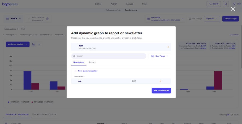
The most efficient way to integrate your chart into a Belga.press analysis report is the third option: exporting it as a ‘dynamic graph in report’. In the following screen, select the newsletter or report where you wish to include the chart. If you have not created one yet, select ‘new blank report/newsletter’. Once you click ‘add to report’, your chart will be included. You can then repeat this process for other charts or begin editing your report or newsletter. For detailed instructions on this process, please refer to the relevant sections of this manual. The primary advantage of using dynamic charts is the ability to add annotations directly within your newsletters or reports. This allows you to provide your audience with essential context or meaning behind specific peaks or dips in your analysis.
Up next
The current suite of features already offers extensive analytical capabilities. Nevertheless, we are already looking ahead! In the future, you can expect an even wider variety of chart types (such as donut, pie, or stacked charts) as well as additional qualitative criteria, including bias and emotionality.